

Some links in this post are affiliate links. This means I may earn a small commission if you make a purchase, at no extra cost to you. I only recommend products I use and genuinely enjoy in my own cardmaking. Read more here.
I saw the Whimsical Day digital stamp from All Dressed Up Stamps and immediately pictured a quiet spring scene. A woman outside for the afternoon. Flowers in her bag. Soft skies behind her. This feminine ink blended card was my way of capturing that simple, happy feeling.
Soft blue sky. Fresh green grass. Warm peachy tones that took a while to get right. Eventually the colours clicked into place.
In this tutorial I’ll show you how I build a soft ink blended background and bring a digital stamp into the same colour story. It is more about small colour choices than complicated techniques.
Let’s get started
Why do some ink blended cards work better than others?
A card usually falls apart pretty quickly when the colours start fighting each other. I kept the background and the colouring in the same colour family right from the start, mostly because I already knew I wanted the whole thing to stay soft. With this feminine digital stamp, I wanted to create a calm scene. A woman enjoying a spring day.
This card works well for friendship or encouragement cards because the colours and layout stay soft and relaxed.
The role of colour harmony in the design process
It is a lovely thought that nature-inspired backgrounds like clouds and grass always work with everything. While these themes feel neutral, the specific ink shades you use can create unexpected challenges. You might find that a certain green ink has a yellow undertone that clashes with a blue marker,.
I often discover that a colour looks beautiful on its own but feels heavy against a soft sky. This happened when I tried using a cool purple for shadows on a warm peachy blouse. The background colours set the mood and dictate which marker shades will feel at home,.
Holding your markers against the finished blending is a quiet way to check for harmony,. You can see immediately if a shade looks muddy or if it sings with the grass,. This small step helps you avoid the doubt of a finished project that feels slightly off,.
The physical card base also plays a role in how your character appears to the eye. My light yellow cardstock made the peachy tones of the blouse look more elegant and soft. Every choice you make builds upon the previous layer to create a balanced result
Why do neutral backgrounds still need colour harmony?
A card often falls apart when the markers on your stamp fight with the background inks,. Even a simple scene like grass and clouds has specific undertones that influence your final look,. Selecting markers with the same warmth or coolness as your blending creates a serene atmosphere.
What do you need to make a soft, feminine ink blended card?
You need a digital stamp, alcohol markers, two Distress Inks, and smooth white cardstock. You can always use substitutes for the materials I mention below.
Here is everything you need to get started.
- All Dressed Up Stamps Whimsical Day digital stamp (May new release)
- Ohuhu alcohol markers (full colour list in the colouring section below)
- Ranger Distress Ink in Salty Ocean
- Ranger Distress Ink in Mowed Lawn
- Smooth white cardstock for the ink-blended panel
- Light yellow cardstock for the card base
- Green wallpaper scraps for the embellishment cluster (free samples from the hardware store)
- Cloud stencil form Carlijn Design
- Blending brushes from StudiolightNL
- Twine
- White pearls
- Memento Tuxedo Black ink
- Foam tape for dimensions
Alternatives for the supplies
You do not need exactly the same supplies to get a similar result. You can swap the digital stamp for any similar stamp you have. Alcohol markers you already own will work fine here. But you can also use pencils or any kind of colouring medium. For the sky, any soft teal or pale blue inks give that same dreamy atmosphere as Salty Ocean. For the grass, any light green that feels fresh and natural is a good swap for Mowed Lawn. Use what you have.
How do you build a feminine ink blended card step by step?
I started with the base card, but honestly the background ended up deciding nearly everything afterwards. Once the sky and grass were done, the marker choices became much easier.
Take your time with each step, and the card will come together naturally.
Step 1. Preparing the card base and panels
Cut your light yellow cardstock to 29.6 cm by 10.5 cm. Score at 14.8 cm. Fold to create a top-fold card.
Cut your smooth white cardstock panel slightly smaller than the front face of the card so that a narrow border of yellow frames the inkwork. I cut it by 10 centimetres by 14.3 centimetres.
Use smooth cardstock for the panel, not textured. Smooth cardstock lets the ink move freely when you blend. Textured cardstock grabs the ink and makes streaks much harder to fix.
That yellow border does more than finish the card neatly. It gives the eye a place to rest around the ink panel and keeps the whole card feeling light and open. Once both pieces are cut, you are ready to start on the background.

Step 2. Creating the soft ink blended background
The background is built in two parts. We will create a soft blended sky at the top and a strip of grass along the bottom. Together, they create the landscape where the character will stand.
Blending a soft cloud sky
Start at the top of the panel with Salty Ocean and apply less ink as you move downward. Leave some white areas visible to create soft, natural clouds between the stencilled shapes. This helps the sky look softer and a little less flat.
Softening the edges is what creates that slightly dreamy feel in the background. Without it, the sky starts to look more graphic and less like an open spring day.
If some cloud edges appear too sharp, you can soften them with the same blending brush, but don’t add more ink to it. Gently work over those lines until the harsh edges soften. Usually that is enough to soften the background again without starting over.
Work lightly at first. It is much easier to add more ink later than trying to fix a dark patch you already hate. And if you find it difficult, practice on scrap paper. When you feel confident enough, you can switch to the background.
Remove the stencil carefully once you are happy with the coverage and set the panel aside to dry before adding the green.
Creating the grassy horizon
Load a fresh blending brush with Distress Ink Mowed Lawn and apply it along the bottom edge of the panel. Blend upward gently so the green fades into the blue rather than meeting it as a hard line. A little texture in the horizon area reads as ground rather than flat colour, so do not worry about a perfectly smooth transition.
Leave enough green at the bottom so her shoes do not look like they are floating.


If you want to practise soft ink transitions first, my spring flower card tutorial walks you through the same technique for a different look.
Step 3. Preparing and colouring the whimsical digital stamp
The Whimsical Day stamp from All Dressed Up Stamps is a digital stamp, which means you print and colour it yourself. I love that about digital stamps because you can resize the image before printing to fit your card. For this card, I printed the image at 11 centimetres high.
Printing the whimsical digital stamping
Print the image on marker-compatible paper. I use smooth marker paper because it lets the ink layer blend without bleeding or buckling. Standard office paper absorbs the ink too quickly, and the colours will spread in a way that is hard to control. It is a small investment that makes a big difference to the finished result.
Open the image in Microsoft Word or any software you prefer. Resize it to 11 centimetres high, then print, and you are ready to start colouring.
Selecting a harmonious alcohol marker colour palette
Before colouring the final print, swatch your markers on a scrap piece of the same paper. Hold the swatches against the background to see if any colour suddenly looks too harsh. A good starting point is the blouse and the trousers.
This step saves a lot of reworking later. Some colours look fine on their own but completely change once they sit next to soft ink blending.
Colouring the Whimsical Day digital stamp
I coloured the Woman from light to dark, starting with the skin and working through the clothing and hair. I used my Ohuhu Markers for this, but you can use any brand or medium you like. Take the colour names and numbers as a guide.
Skin
- YR00 Barely Blush
- YR03 Peach Blush
- YR312 Light Earth Tone
YR00 Barely Blush goes on first as the base tone across all skin areas. YR03 Peach Blush adds warmth to the cheeks, the jaw shadow, and anywhere the face needs a little depth. YR312 Light Earth Tone is used very sparingly in the deepest shadows only. A small amount of that darkest tone goes a long way
Blouse
- Y46 Peach Yogurt
- E46 Coral Sand
- YR314 Sandalwood
The warm peach-colored blouse provides warmth and fits the cottagecore theme.
I started with Y46 Peach Yoghurt across the full blouse area. E46 Coral Sand went in next for the mid tones, and YR314 Sandalwood into the deepest shadows. These warmer tones worked much better once the yellow card base was underneath them.
Trousers
- BG24 Sea Glass Blue
- BG114 Faded Teal
- BG314 Peacock Green
The trousers are cooler than the blouse on purpose. At first everything was starting to look too peachy and flat, so the blue tones helped break it up a bit.
BG24 Sea Glass Blue is the base, BG114 Faded Teal builds the mid-tones, and BG314 Peacock Green goes into the deepest shadow areas.
Hair
- Y62 Sandy Beige
- Y515 Light Walnut
- E58 Fawn Brown
Sandy Beige Y62 is the base tone across the full hair area. Y515 Light Walnut builds the mid tones, and E58 Fawn Brown goes into the deepest areas. Switching to these softer tones took the weight out of the hair straight away.
Flowers and leaves
For the flowers and leaves in the bag, I used pink and purple tones from my Ohuhu collection. The exact shades matter less than keeping them warm and soft enough to sit within the overall palette. Use whatever florals you have available and let the colours in the bag guide you.
Adjusting colours along the way
Here are two adjustments I made during this project that might save you some time.
The first was on the blouse. I had planned to use E92 for the shadows, but when I held it against the warm background and the peachy base tones, it pulled too cool and too purple. Switching to YR314 Sandalwood brought the warmth back straight away.
The second was on the hair. YR314 was my first thought there, too, but against the soft blended sky and the light card base, it looked too heavy. The combination of Y62, Y515, and E58 gave the hair a softer, quieter presence that felt much more at home on this card.
Both times the fix was simple.Hold the marker against the background before committing to a full area. That small step saves me from a lot of colour mistakes later on.
Fussy cutting the coloured stamp
Once the colouring is complete, trim closely around the character using sharp scissors. Fussy cutting takes a little patience, but the result is worth it. Turn the paper rather than the scissors as you work. That gives you much better control around the tight curves of the hair and the flowers in the bag. Take your time, and the woman will sit beautifully in the scene.

Step 4. Stamping the sentiment and building the scene
This is the step where all the separate elements come together into a finished card
Stamping a clear sentiment
For this card, I used the sentiment ‘it’s time for something nice, like flowers and blue skies’. It connects directly to the blended sky and the flowers in the woman’s bag. It fitted the scene better than the other sentiments I tried.
Position the sentiment to the right side of the panel and stamp with Memento Tuxedo Black ink. Ink the stamp fully and press down firmly for a clean impression. A stamping platform locks both the stamp and the panel in place so you can lift and reposition without losing alignment. That takes a lot of the guesswork out of getting a straight result.

Grounding the character in the scene
Adhere the woman to the left side of the panel using foam tape. The foam tape lifts her slightly off the surface, which adds a sense of depth to the finished card. Because it is placed on the left side of the panel, it looks as if it is walking into the scene. This works wel with larger images.
Her feet should sit in the grass, not float above it. If she looks like she is hovering, move her down slightly until her shoes sit in the green ink along the bottom edge.
This grounding step is what makes the scene feel real. Without it, the figure can look like she is cut out and placed on top rather than part of the background.
Step 5. Building a layered embellishment cluster
Start with the die-cut leaves from the green wallpaper scraps. Place them below the sentiment text and angle them upward. Then add the die-cut flower from white cardstock in the centre.
Use liquid glue for both the leaves and the flower. It gives you much more control over small elements than tape or a glue pen. This will make everything exactly where you want it, easier.
The wallpaper leaves worked surprisingly well with the green ink in the background because the tone is darker.
The white flower was coloured with the same Ohuhu markers as the blouse. Using the same colour on the flower helped the embellishments fit the card better. When you doubt what colour to give to an element. Repeat the colour that is already on the card. This will connect the elements.
Without the twine and pearls, the card still worked. But it looked a bit empty.
Wrapping and securing the twine
Cut a length of twine and wrap it around the top edge of the ink panel. Secure the ends to the back with double-sided tape. Tie a small bow from the same twine and add it to the twine with a glue dot. Making the bow separately gives you much better control over the shape.
Adding pearls for a soft finish
Place three white pearls above the sentiment text, two near the die-cut leaves, and one in the centre of the wallpaper flower. The top area still looked a bit empty, so I added a few pearls.

Assembling the finished card layers
Attach the completed ink panel to the yellow card base using foam tape. The twine adds a little thickness behind the panel, so foam tape also helps keep everything sitting flat.
Without that balance, the panel can start to bend slightly once layers build up. Foam tape keeps the card structure clean and stable so the finish stays neat.

What can go wrong with a feminine ink blended card, and how do you fix it?
The two things that usually go wrong for me are are a background that feels too intense and marker colours that clash. Both are fixable, and neither means starting over. Most mistakes are fixable, or you can cover them up.
How can you use this feminine ink blended card layout for other occasions?
If the background looks too saturated, the first layer was probably too heavy. For future panels, start with barely any ink on the brush and build up slowly in thin passes.
If the background is already too dark, try working with a clean brush with no ink over the surface in gentle circular movements. Sometimes that is already enough to blur the harsh edges a little.
Distress Ink is water-reactive, which means a tiny amount of water on a brush can lift and spread the ink further. Always test this on a scrap of the same paper before trying it on your actual panel.
What to do when marker colours clash
Clashing colours usually happen when warm and cool undertones mix without you noticing. If a marker looks off against the background, try adding a warm neutral tone, like a pale beige or warm grey, over the edges where the colours meet. That softens the transition without having to recolour the whole area.
The approach is the same as ink blending. Work lightly, build slowly, and test on a scrap first.
Connecting the digital stamp to the scene
If the woman looks like she is sitting on top of the background rather than in it, the fix is almost always placement. Lower her until her feet sit clearly in the green ink along the bottom edge.
You can also blend a thin layer of Mowed Lawn directly under her feet with a small brush. That small step ties her into the scene and makes a big difference to how grounded the finished card feels.
How can you use this feminine ink blended card layout for other occasions?
This layout works for any season, any sentiment, and any feminine stamp you own.
Here are a few directions you can take it.
Other colour combinations for distress ink blending
The background works in any season with the right ink choices. For autumn, Distress Ink in Crackling Campfire and Scattered Straw give a warm golden atmosphere. For spring, Mowed Lawn paired with Spun Sugar creates a soft pink and green palette
The same layout for other feminine stamps
The Whimsical Day card layout, a standing woman against an ink background, is a format that works for any feminine character. Any stamp with a woman or girl at a similar scale will sit well on this card size and scene setup. The key is still colour harmony. Build the palette from the most distinctive detail colour in the stamp and let that choice guide everything else.
My flower girl card with All Dressed Up Stamps is a good example of how the same serene style translates to a different character and occasion.”
Varying the sentiment for different occasions
Swapping the sentiment is the most direct way to repurpose this card design. A “thank you” sentiment transforms it into a gratitude card. “Thinking of you” shifts it into something quieter and more personal. The soft, feminine card ideas stay intact because the composition does not change, only the words.
Frequently asked questions
Do I need a special printer to use digital stamps?
Any home inkjet printer works well for printing digital stamps. The most important thing is the paper you print on. For alcohol marker colouring, use smooth, marker-compatible paper rather than standard office paper, which will bleed and buckle.
Can I use a different brand of alcohol markers instead of Ohuhu?
Yes. The colour numbers listed in this tutorial are Ohuhu-specific, but the logic of the alcohol marker colour palette transfers to any brand. Match the undertones and values rather than the numbers, and test on a swatch before colouring the final print.
How do I stop the ink-blended background from looking streaky?
Streaks usually appear when the blending tool carries too much ink in one pass. The fix is less ink to the brush and building the colour in multiple thin layers. Allow each layer a moment to set before adding the next one, and use a circular or side-to-side motion rather than dragging the brush in a single direction.
Let’s Get Creative Together
This was one of those cards where I kept adjusting little things as I went. For me, the nicest part of making cards like this is slowly adjusting the colours until everything finally works together. The background, the stamp, and the small details all need a bit of tweaking before the scene starts feeling natural.
You do not need perfect blending for cards like this. Half the time I think a colour works until I hold it against the finished background and realise it needs swapping. That is just part of the process.
I would love to see your version of this card. Share it with me on Instagram and let’s see what colour harmony you build from your own Whimsical Day stamp.
More Feminie card ideas

Easy Arch Card Tutorial with a Soft Floral Design
The arch shape is a lovely way to add softness to your designs. You can create this beautiful look using a common bowl from your kitchen. This tutorial helps you practice gentle lines and floral arrangements at your own table.
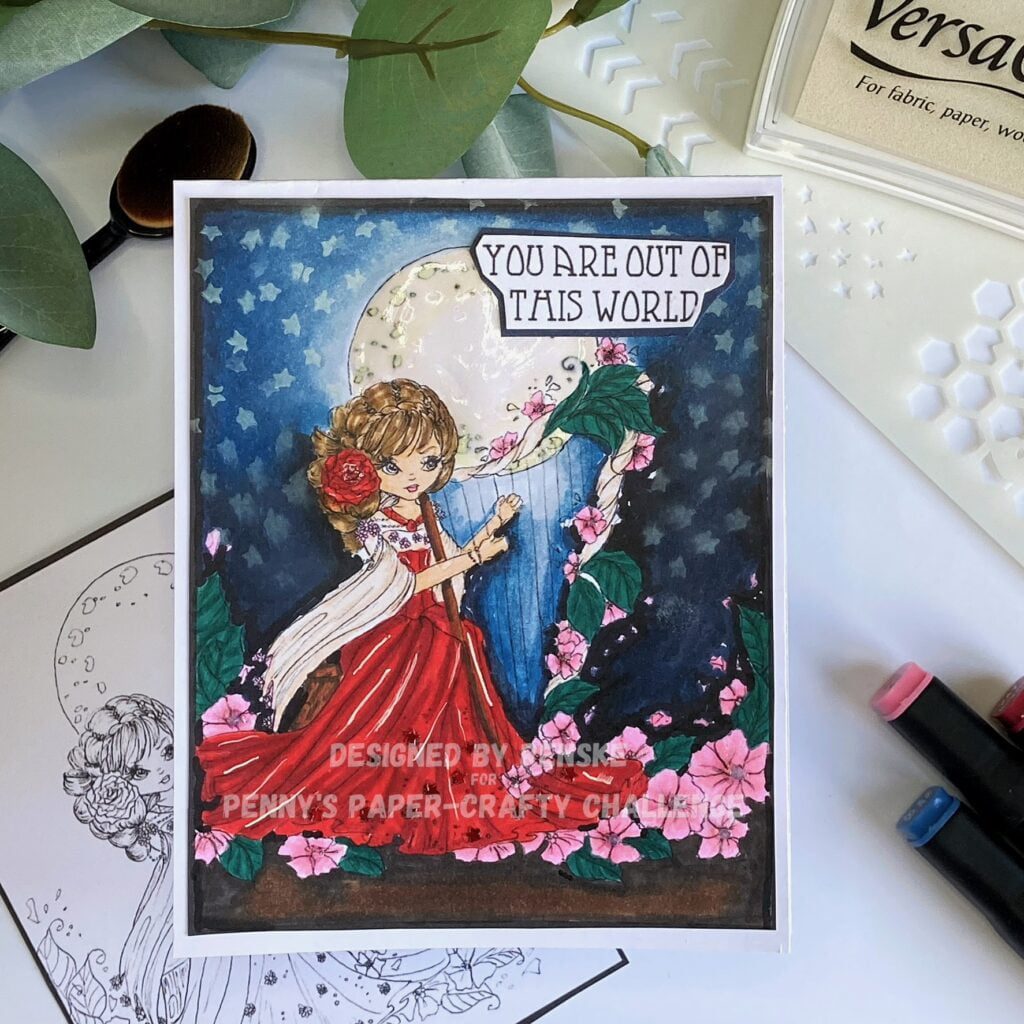
Creating a Magical Card: Unveiling the Night Sky Tutorial with a Large Digital Stamp
Large digital stamps are a wonderful way to build a complete scene on your card. This one is a beautiful feminine scene. This tutorial guides you through creating a dreamy night sky with soft ink transitions. It helps you find confidence when colouring detailed illustrations with your markers.
Feminine Card Design Made Quick and Easy: Step-by-Step Guide
Creating something special does not require a large collection of supplies. This guide focuses on a simple and elegant approach that works well even when your resources are limited. It is an achievable project for a quiet afternoon of mindful making.
Products used
Whimsical Day Digital stamp All Dressed Up Stamps

Distress Ink Salty Ocean

Distress ink Mowed Lawn

I would like to enter my card in the following challenges
- Word Art Wednesday: Anything goes
- CREATIVE INSPIRATIONS: Anything goes
- Crafty Catz: Anything goes
- Cut It Up: Friendshop
- Allsorts challenge blog: Anything goes
Renske, First of all your card is lovely! I agree with you, that girl is just so very sweet. I also love what you did with the background. What I really find fascinating is all of your thoughts on different colors and how they go or don’t go together. I know I have seen that in my own craft room, but never thought about it in such detail. Have you ever thought about making YouTube videos? I think your insight would be very valuable to so many people. Thanks so much for playing along with us at Word Art Wednesday. We appreciate your participation!
Hi Barbara. Thank you so much for your lovely comment. I am thinking about starting a youtube channel. I have one, but not posting a lot on it.
This is a great motivation to be more serious about my channel. Thank you for your insight.
Super card, a lovely spring scene. Thank you for joining in the Allsorts birthday celebrations.
Liz xx
Thank you so much
A lovely feminine image, fab colouring and beautiful blended background. Thanks for joining in at Crafty Catz.
Thank you so much for your lovely comment.